T.F. South High School
Identity Rebrand
Branded Graphics / Enviromental Branding
Thornton Fractional South High School (TF South), located in the south suburbs of Chicago, has long been a pillar of academic and athletic pride. But as cultural awareness deepened across the student body, a movement emerged to retire the “Rebels” mascot—an identity rooted in outdated symbolism—and replace it with something more inclusive, empowering, and future-facing.
The rebranding was sparked by student voices. Through forums, surveys, and spirited debate, the Red Wolf emerged as the new symbol—representing resilience, unity, and forward momentum. The mascot change wasn’t just cosmetic; it was a cultural reset.
Challenge
The challenge was twofold:
- Honor the school’s legacy while embracing a new chapter.
- Create a bold, unified brand identity that could energize students, faculty, alumni, and the broader community.
Creative Approach
As creative and studio lead, we guided TF South through a full-scale identity transformation:
Logo & Mascot Redesign
- Developed a dynamic Red Wolf logo that balances athletic aggression with academic pride.
- Incorporated bold typography and a modern color palette rooted in TF South’s heritage.
- Designed scalable assets for digital, print, and environmental use.
Environmental Branding
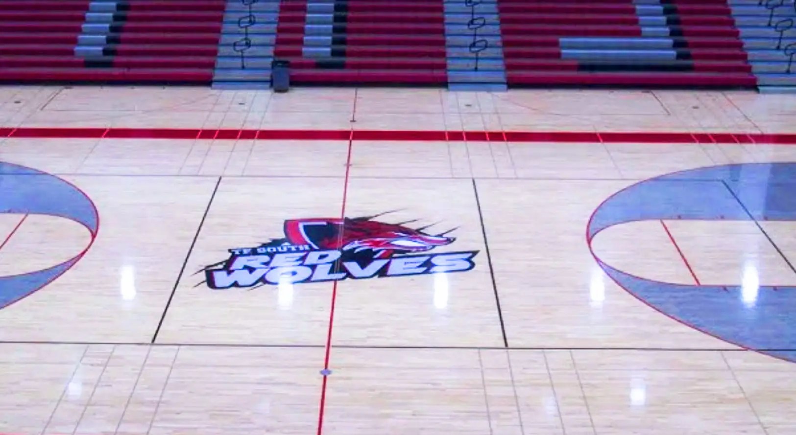
- Athletic Gym: A full-scale logo showcase now anchors the gymnasium, energizing athletes and spectators alike.
- Football Field: The Red Wolf emblem is proudly displayed at midfield and on end zone wraps.
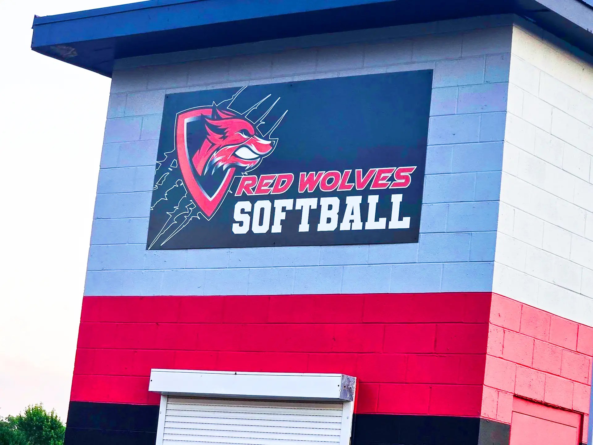
- Softball & Baseball Fields: Dugouts and outfield signage now feature the new identity, creating a unified athletic experience.
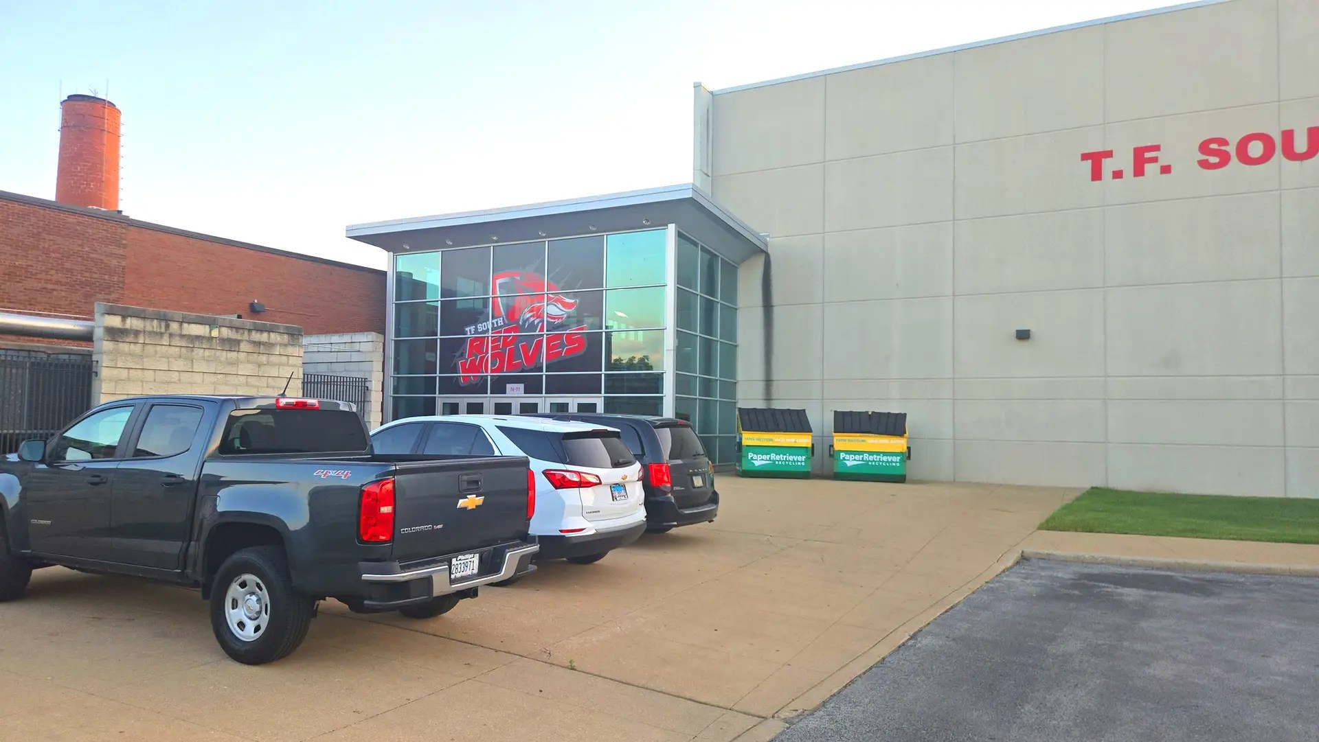
- Outdoor Signage: All campus signage was updated to reflect the new brand, signaling transformation to the community.
- Window Graphics: Over 20% of the building’s windows now feature oversized Red Wolf graphics—visible from blocks away and symbolizing pride from every angle.


Impact
Student Engagement: Record participation in athletics and spirit events following the launch.
Community Support: Positive feedback from parents, alumni, and civic leaders.
Cultural Shift: The Red Wolf now stands as a symbol of unity, strength, and progress.
Strategic Takeaway: This wasn’t just a logo change—it was a redefinition of identity. By listening to students and translating their vision into a cohesive brand system, TF South now moves forward with pride, clarity, and purpose.